31/32 Chiyoizumi distillery 1948-2018- No.31
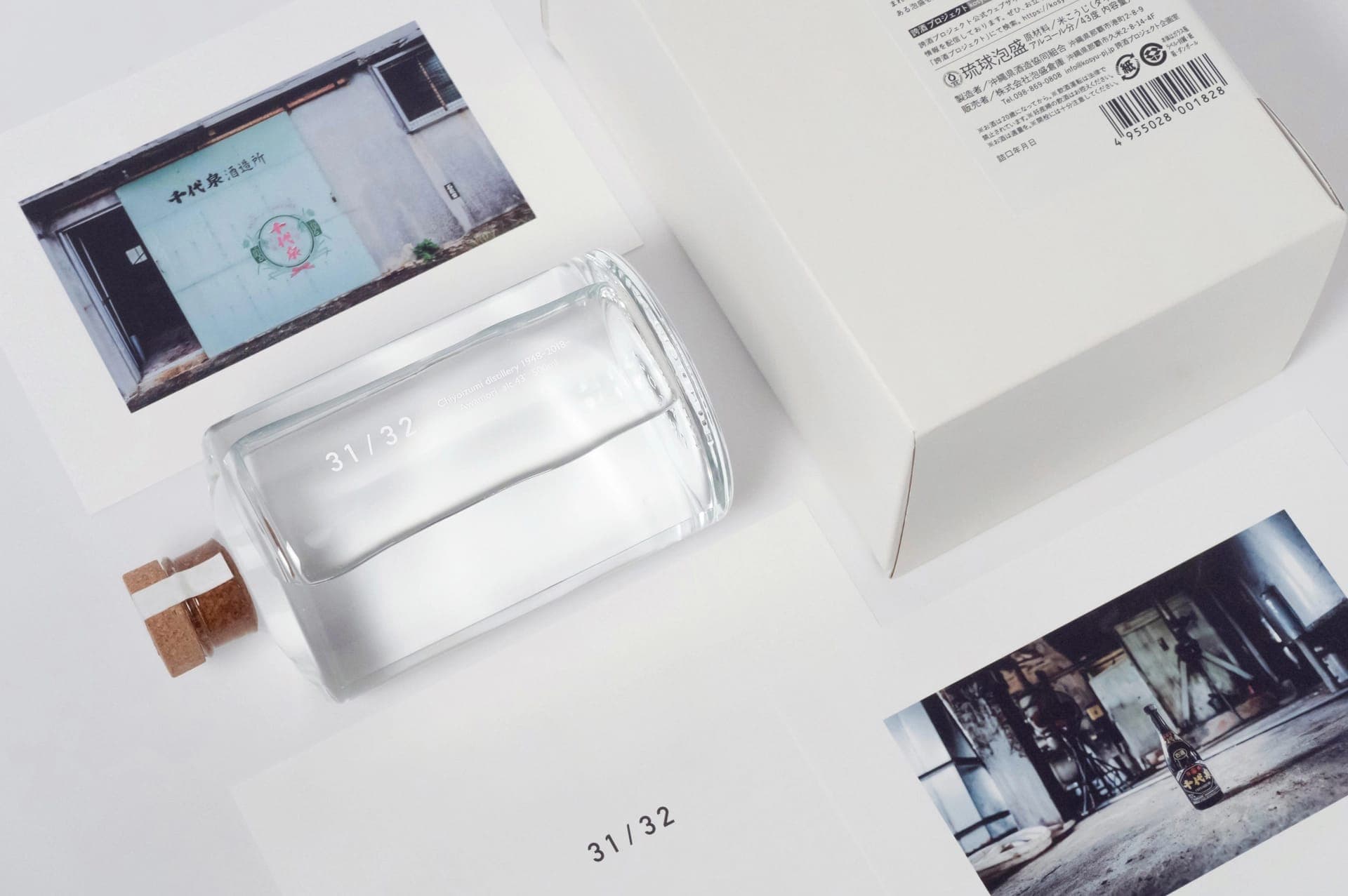
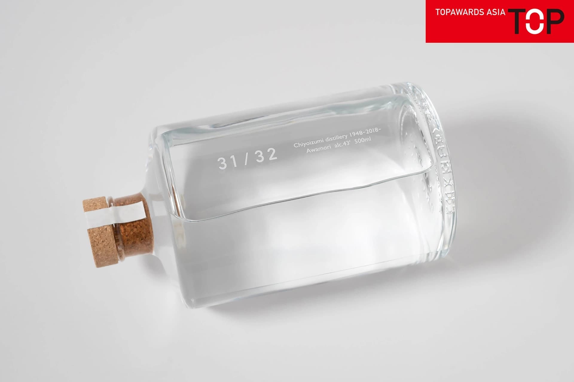
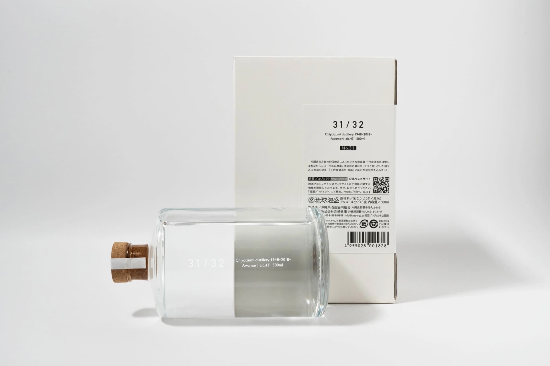
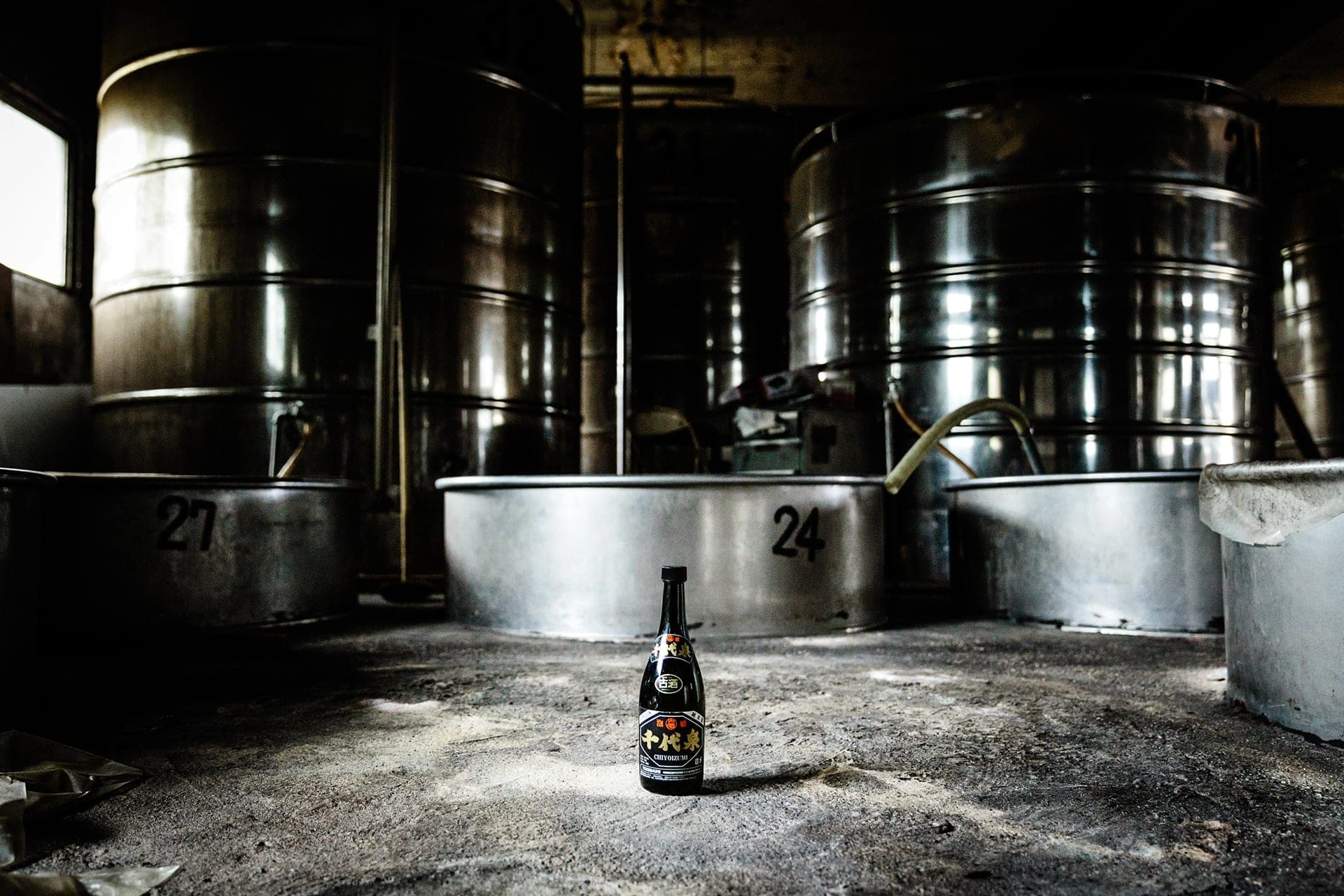
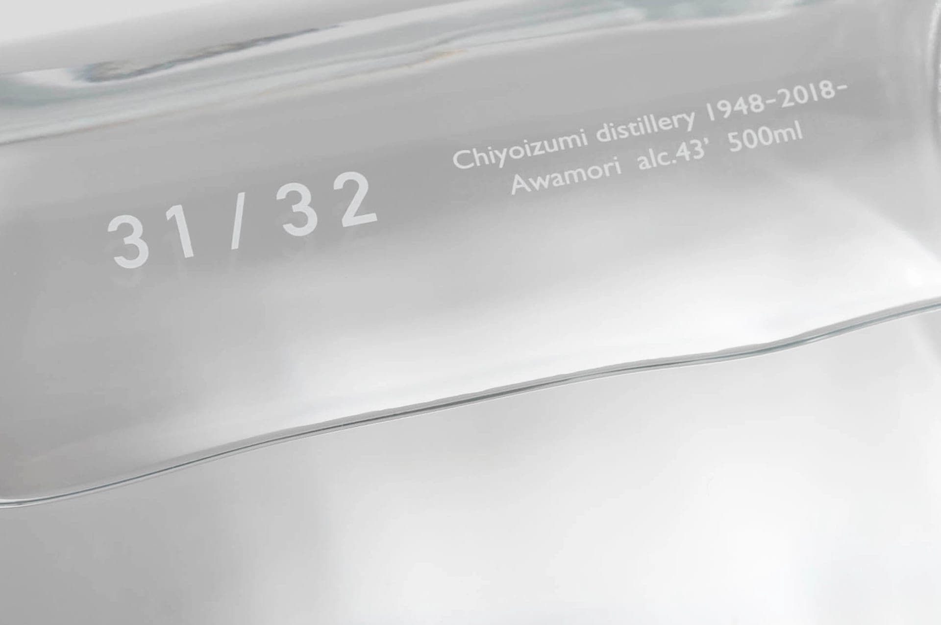
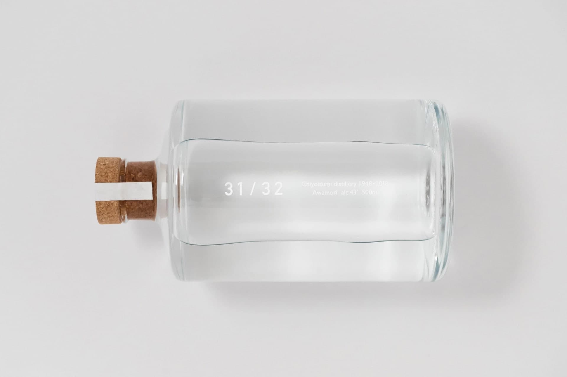
沖縄県宮古島・狩俣地区にある泡盛蔵「千代泉酒造所」の泡盛を対象とした、リブランディングおよびデザインプロジェクト。蔵内に整然と並ぶ大型タンクから着想を得て、清楚でシンプルな造形へと再構築した。素材には、リサイクル可能なソーダ石灰ガラスとコルクを採用。ボトルの円柱形状を活かし、裏ラベルを斜めの側面に配置することで、正面から見た際に光の屈折による写り込みが起きないよう設計している。外装箱はボール紙に白一色のエンボス加工で商品名を記載。TOPAWARDS ASIA受賞。 A rebranding and design project for the awamori produced by Chiyoizumi Distillery, located in the Karimata area of Miyako Island, Okinawa. Inspired by the large tanks lined up inside the distillery, the bottle was redesigned with a clean and minimal form. The materials used include recyclable soda-lime glass and cork. Leveraging the cylindrical shape of the bottle, the back label is placed at a diagonal angle to prevent unwanted reflections caused by light refraction when viewed from the front. The outer box is made of white, single-color embossed paperboard featuring the product name. Recipient of the TOPAWARDS ASIA.
Client: 泡盛倉庫 千代泉酒造所
Creative Direction, Design : 福田 peco 知広 (BARBE)